Hey Everyone, welcome back to Colourful Friday.
As promised today’s post is about value. Value is the relative lightness or darkness of a fabric. Last week I talked about tints, shades and tones and how these help to create light and dark fabrics.
Value is very important in quilt making whether it be a traditional patchwork quilt or an art quilt. Without the use of value there would be no contrast in the quilt and contrast is what draws the eye to the quilt. The use of light, medium and dark valued fabrics or colours within the piece is what creates the contrast. Depending on where these values are placed and what other value they are placed beside will result in varying degrees of contrast.
Value Represented On The Wheel
Each colour wheel is different but for the most part each colour is represented with a tint, shade and tone or light, dark and medium valued version of the colour.
Here are some examples of different wheels and how they present the different values for each colour.
A very easy to read wheel for value.
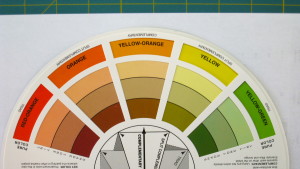
This colour wheel shows the pure colour in the outermost ring, then the tint in the next ring, followed by tone in the next ring and finally shade in the inner most ring.
Not quite as easy to read.
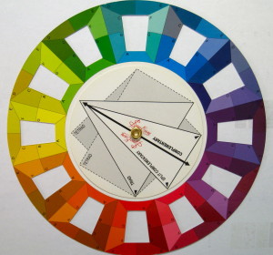
This colour wheel divides each colour area up into 7 sections to represent the tints, shades and pure colours of each colour.
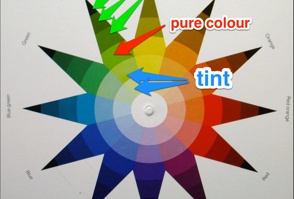
The Colour Star – easy to follow and read.
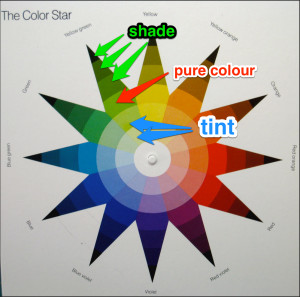
Each colour on the star has the pure colour in the middle, the shades going out to the tip and the tints inward to the centre.
An interesting fact is that yellow is the lightest colour on the colour wheel even when it is at it’s most intenseness it remains the lightest of all the colours. Even though yellow reads as the lightest of all the colours it has a big impact when used so needs to be used carefully.
Determining Value
There are a couple of different ways to determine value of fabrics especially if they are placed side by side.
Squinting
Yes, good old eye squinting will help to determine value of colour. When squinting the eye is closed enough that the colour receptors in the eye are not working and so the eye can only see in grey scale. By only seeing in grey scale the colour has been removed and the value of the colour or fabric is seen easier.
Taking a photograph
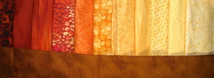
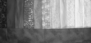
Taking a photograph of the fabrics and then changing it to black and white to create a grey scale photo will help to determine the value of the colour. This can be done right on the camera or in photo editing software. I find this method the best and use it all of the time especially when I am making colour runs for a Bargello.
In the photo below I have placed the fabrics in a run according the order in which my eye sees the value or perceives he value of each fabric from dark to light.
Removing the colour from the photo leaves one with a grey scale version of the fabrics. It can be quite interesting to see what was thought to be light may actually be medium or vice versa. As well what was considered to be the darkest may not be. Here is the photo from above turned into black and white.
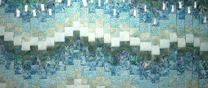
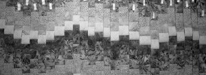
Another example using a bargello run.
Contrast in Designs
Contrast is created with the use of different values and contrast in a design is the first thing the eye will see. This is true at a distance and up close. Having well proportioned value in a design is of utmost importance.
Tune in next week to learn more about how value is used to create contrast in a quilt design.
Happy Quilting!





“Removing the colour from the photo leaves one with a grey scale version of the fabrics”
That is a wonderful idea for those that can’t quite distinguish it otherwise! Winning IDEA! Yeah! Sharing this!
Thanks Lisa. Definitely feel free to share this as it is a great tool to help with value of fabrics.