
Hey Everyone, welcome back to Colourful Friday on Saturday.
Last week I just started to touch on what value is in relation to colour and fabric. Prior to that there was a little lesson on tints, shades and tones which are what create value changes in colour.
Contrast – what is contrast?
In art, contrast refers to the arrangement of opposite elements such as rough vs smooth texture or small vs large. In quilting we also consider light vs dark to be one of our opposite elements and the easiest to employ in our quilts.
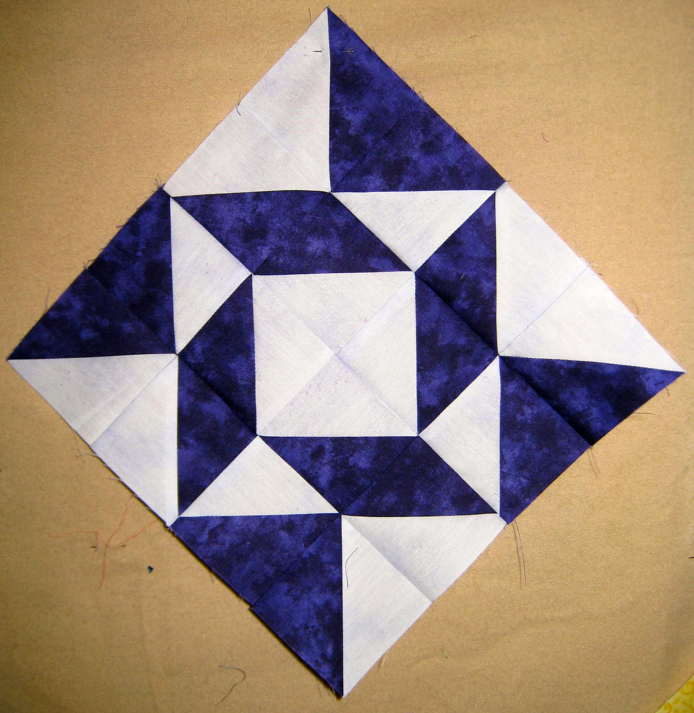
The use of black or white will create very high contrast within a design.

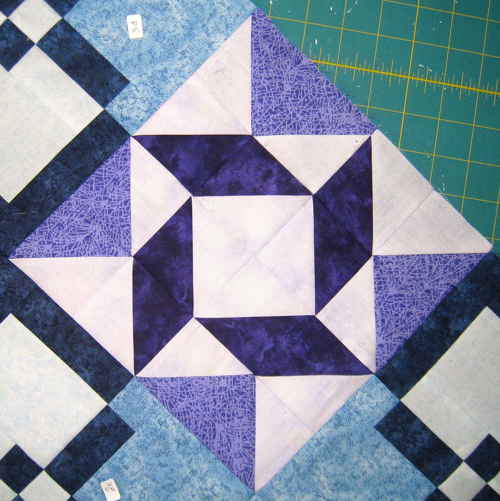
The use of white between the coloured squares makes the colours pop out.
As will the use of complementary colours.

Complementary colours of red and green create high contrast along with the white star.
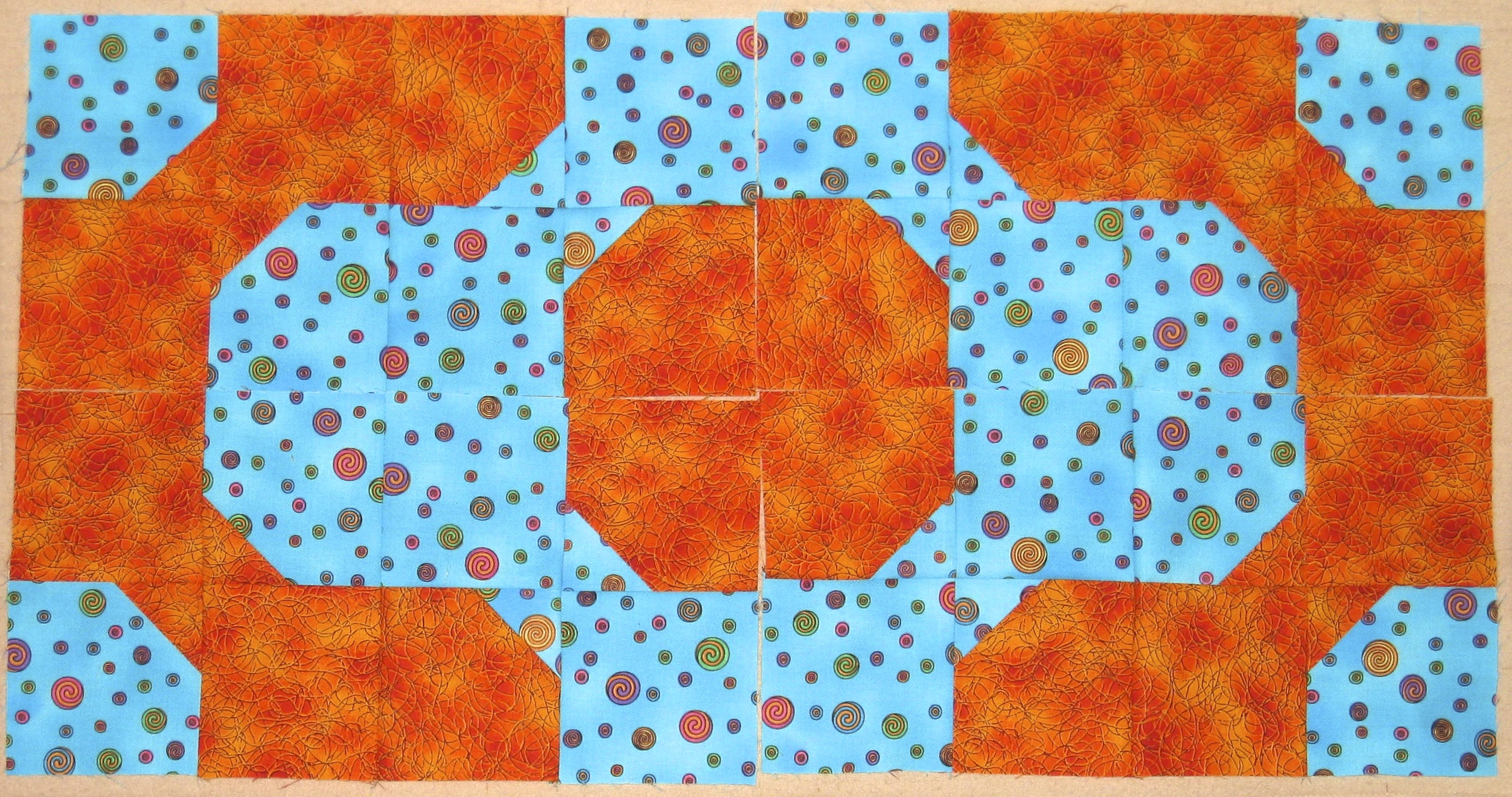
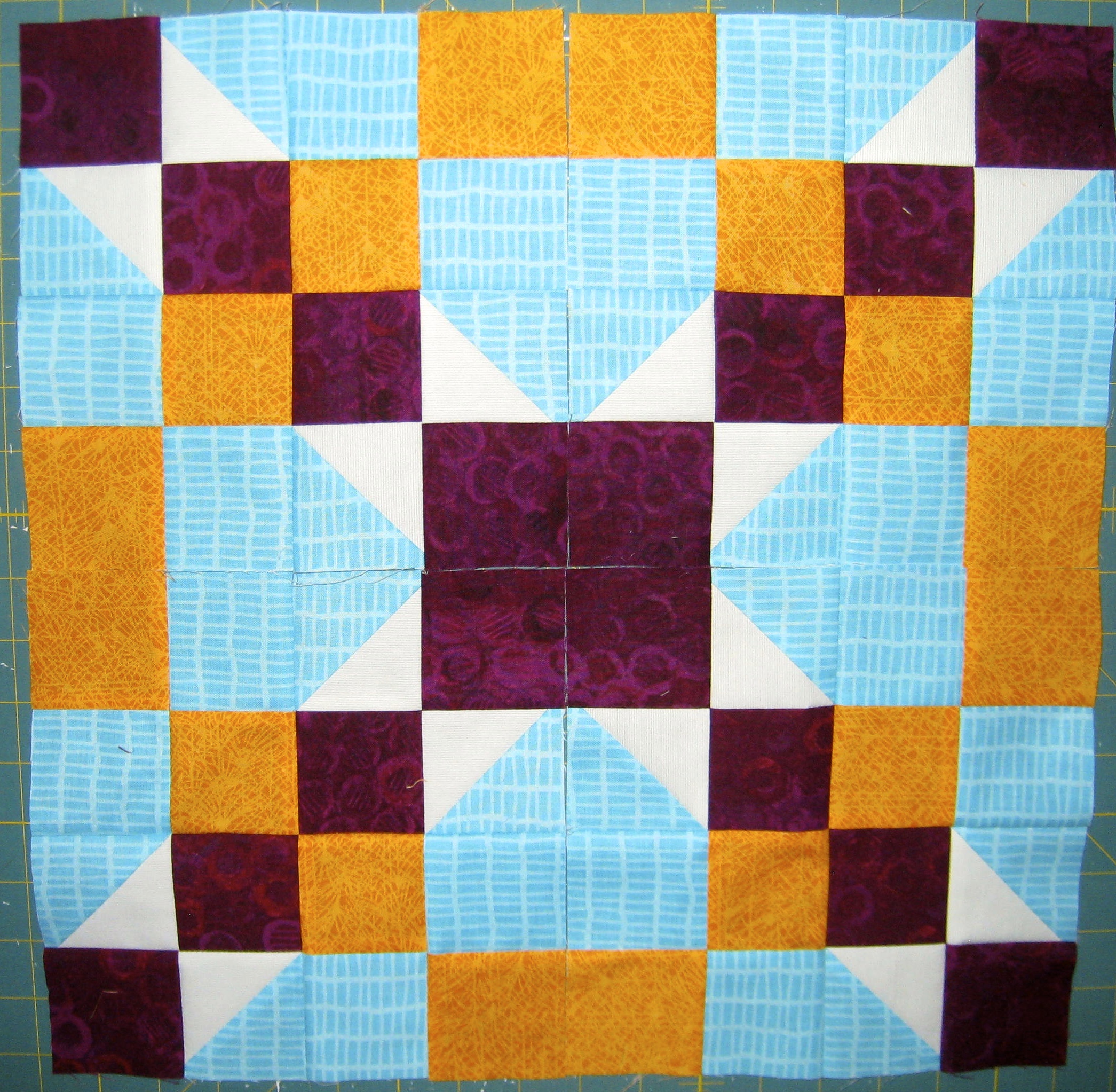
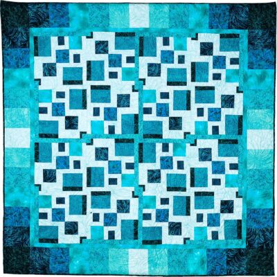
The complementary colours of turquoise and orange create great contrast.
Contrast is used to create interest and visual appeal to a design. Additionally, contrast directs the eye to a certain area within the design.
How To Create Contrast In Your Quilt Design
To create contrast with fabric a variety of light, medium and dark valued fabrics need to be used. Balancing these three values is what creates great contrast in a quilt.
Using only dark and light values in a quilt will have the effect of a dull quilt. Even though the quilt has high contrast the placement of light and dark beside each other can cause the darks to look dull and the lights to also look dull.
This light and dark block looks dull and boring.
Add medium value fabrics to balance these high contrast fabrics. The medium valued fabrics connect everything together and create pleasing design flow for the eye to follow. They also help to maintain the high contrast of the dark and light fabrics.
Adding in a medium value gives the block balance between the three fabrics and creates a block that is no longer boring.
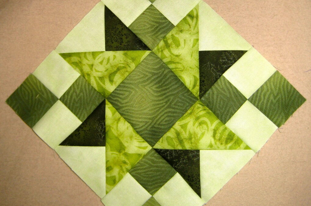
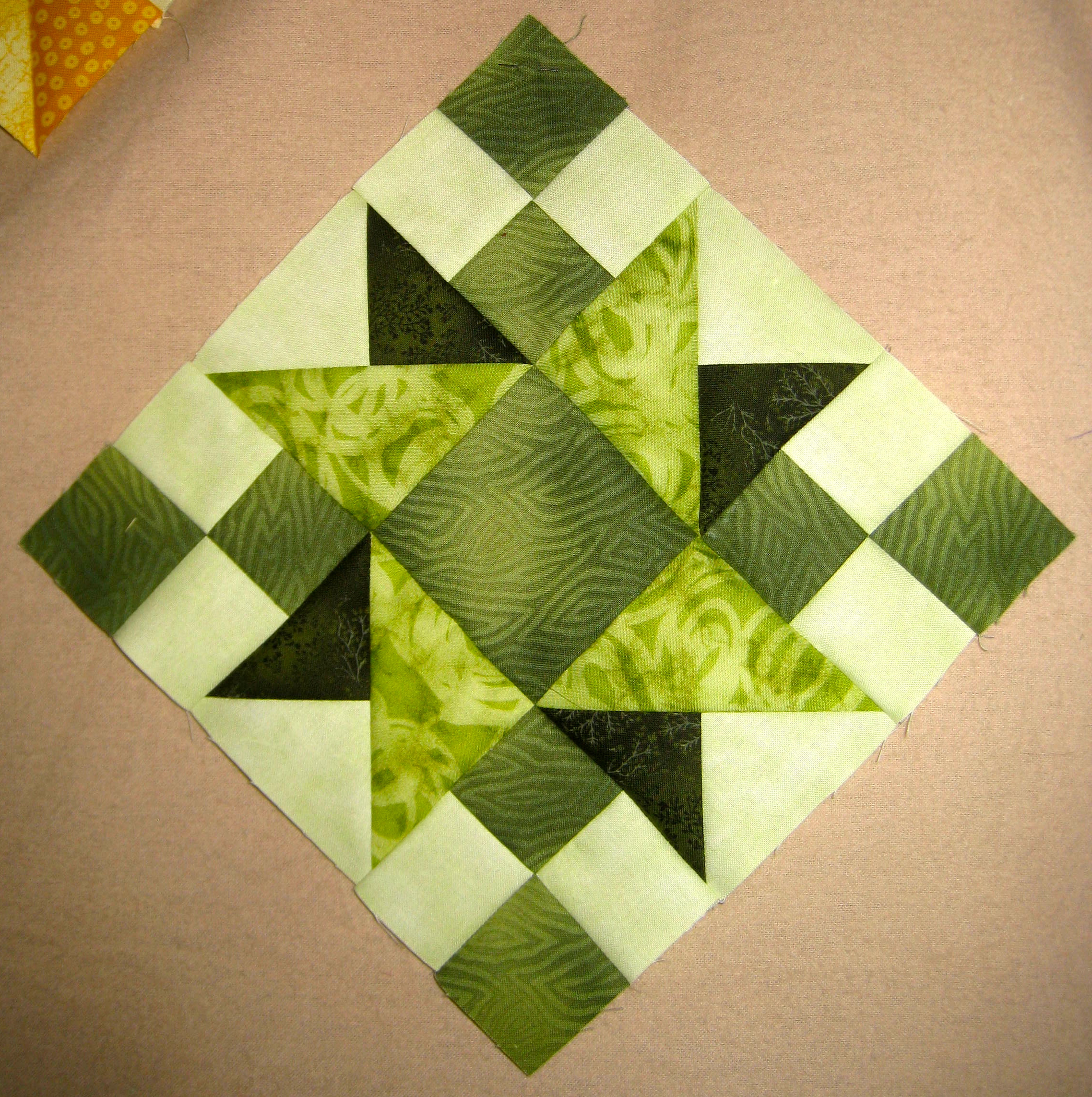
The green block below is well balanced with the use of light, medium and dark valued fabrics creating eye pleasing contrast within it. The block has two pinwheels in the centre – one in a dark green and one in a bright medium green. The other medium green in the block provides a visual point of squares going from one corner to another.
One light, one dark and two medium greens make up this nicely balanced block.
The same can be said for using only medium valued fabrics in a quilt – there will be little contrast creating a dull quilt with no pizzaz.

Even thought he dolphins are lighter there is little to no contrast in the quilt seeing how mostly medium valued fabrics were used.
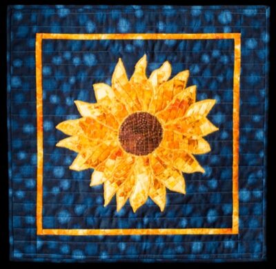
Remember that cool colours appear darker than warm colours and will recede into the background while the warm colours will pop out more in the design than the cool colours.
The orange being a warm colour pops out in the design while the cool colours tend to recede to the back.
As I mentioned last week, yellow is a warm colour and also the lightest colour on the wheel even at it’s most intense. This means that yellow will be quite dominant in a quilt and needs to be used in proper proportions.
The yellow appears as the lightest fabric in the quilt.
Playing with fabrics – placing them side by side with different colours and values and then taking photos in black and white will help to determine how they react to each other as they sit side by side.
Another excellent exercise to learn value and placement of fabrics is to work with black and white fabrics. Creating a design with these fabrics is a challenge as there is no colour to fall back on so placement of different values is crucial to making the design work. In this Granny’s Choice block below I chose to work in an achromatic scheme using only tonal value to create contrast (oh and large vs small pieces, of course).

The white, grey and black create contrast within the block with secondary designs emerging.
As you can see contrast can really make or break a design.
Colour gets all the credit and value does all the work – not fair for value but unfortunately the truth.
Happy Quilting!


I have books and books on colour that I have not been able to absorb/digest. This is wonderful, I really understand and I think it will help me to apply as well. You explain so simply what others make seem so difiicult. Absolutely brilliant, Thank You!
Love your posts!
thank you.