Hey Everyone, welcome back to Colourful Friday.
The past month or so I deviated from the colour schemes and discussed a few other very important topics related to value and colour. These have included warm and cool colours as well as what are tints, shades and tones.
This week I am going to head back to the colour schemes as there are still a couple to cover.
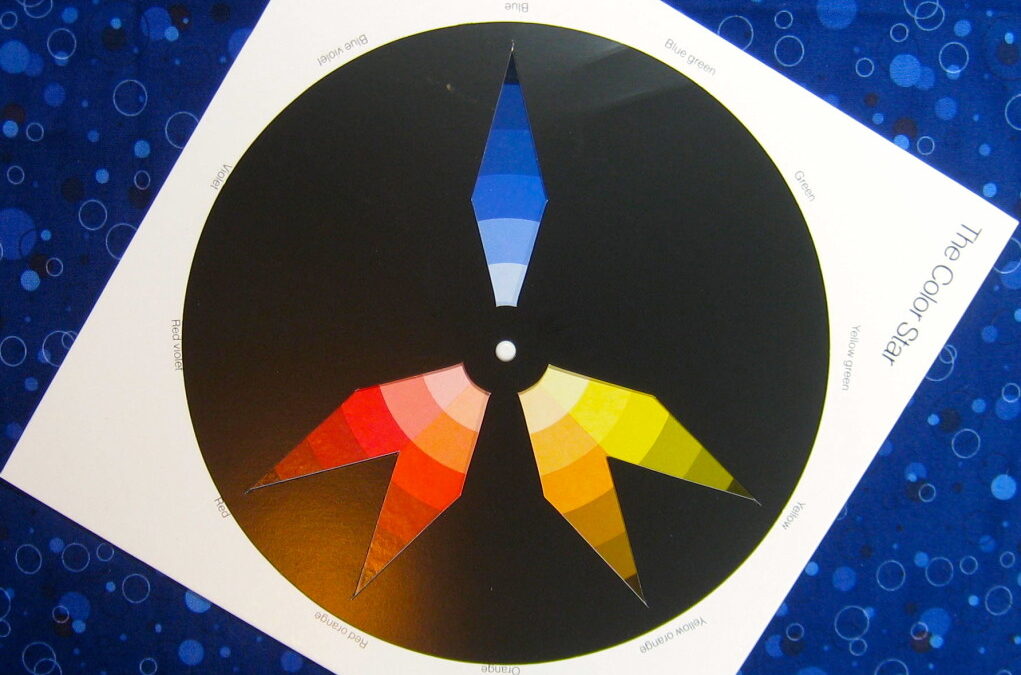
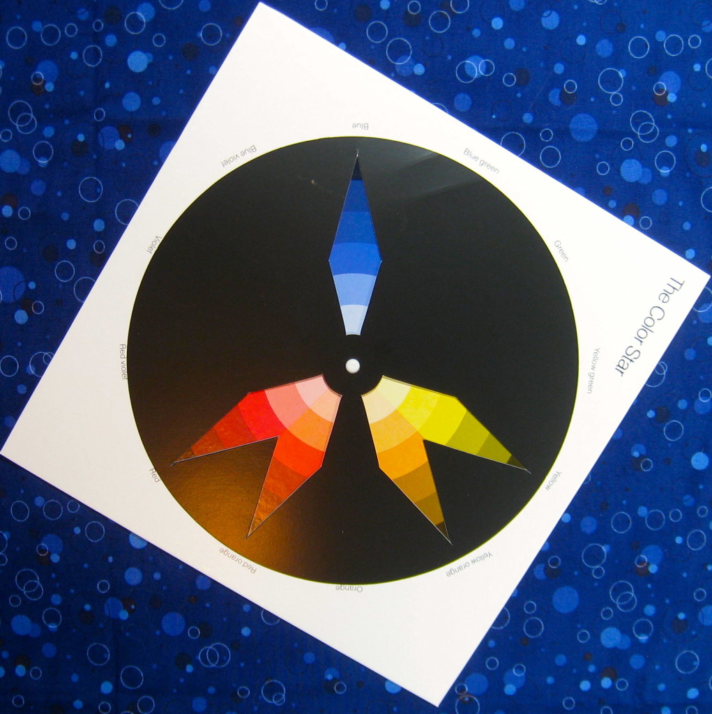
Many weeks ago I wrote a post titled what is a split-complementary scheme and this week I am going add a plus to this scheme. As you may recall a split-complementary uses one colour of a complementary pair and the two colours on either side of the second colour in the pair. A total of 3 colours.
The split-complementary plus scheme is comprised of 5 colours.
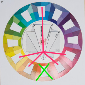
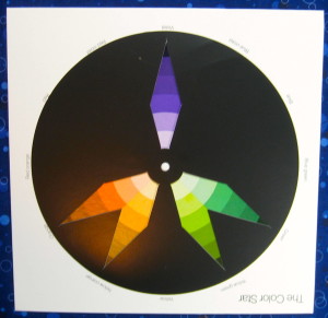
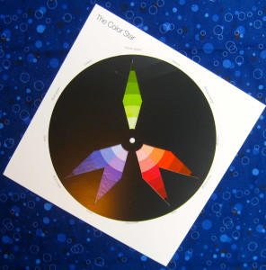
What does a split complementary plus scheme look like on the colour wheel?
This is what it looks like on the wheel.
To start, pick the colour that is going to be the main colour in the quilt. Go directly across the wheel to it’s complementary colour. This colour will be removed from the scheme but the four colours on either side of it will be used.
While this is not one of the more common colour schemes but it can be very effective when the proper balance of colours is used with different values of the colours. Choosing the right balance of value will create contrast in your quilt and hence make the design pop.
Aztec Jewel Block
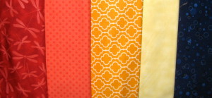
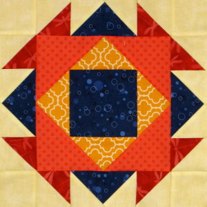
This past Wednesday for Stash Blasting Wednesday I introduced the Aztec Jewel block which is made with 5 different colours. These 5 colours make up a split-complementary plus scheme.
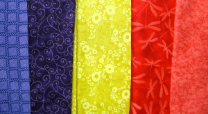
I chose blue as my main fabric. The complement of blue is orange. The orange of course was dropped out of the scheme and the 2 colours on one side of the orange and two colours on the other side of the orange are added into the scheme. These four colours are red, red-orange, yellow-orange and yellow. This group of five colours includes all of the primary colours.
In order to make the block work different values of each colour were needed. Wanting blue to be the dominant in the block I decided that it should be dark. I didn’t want the yellow to stand out a lot so I made it the lightest value. The red is fairly dark as well while the other two colours are of medium value.
The blue and red being cool colours recede to the back of the quilt. The blue creates a square behind the squares in front which tend to come forward being warm colours. Even the blue square in the middle recedes to the back popping the warm coloured squares to the front. The placement of the values is what creates the effect in this block.
Some Other Examples of Split-Complementary Plus Colour Schemes
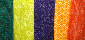
What if purple is the feature colour in the scheme? Which other colours will be added to make up the five? We know that yellow is the complement of purple but it is not going to be used. The four colours on either side that will be included in the scheme are: yellow-green, green, yellow-orange and orange. This group of colours includes all of the secondary colours.
What if yellow-green is the feature colour in the scheme. Which other colours will be added to make up the five? We know that red-violet is the complement of yellow-green but it is not going to be used. The four colours on either side that will be included in the scheme are: red, red-orange, violet and blue-violet.
An interesting twist on the split-complementary scheme. Just add a couple of other colours to create the plus.
Happy Quilting!

By the way – I’m participating in a Linky Party called Design Wall Weekends at Fibre Artist Journey. Click on the badge below to go the party and check out dozens of other really great quilting bloggers.
![]()




What a fantastic explanation of split complementary colors! This can be such an exciting, vibrant choice for designs!
Thanks, Christina. Yes, the colour scheme certainly can be very dramatic and exciting.
Another great color post!
Thanks, Ruth. I do love colour.
Thanks for the great color information!
My pleasure Jamie.