Hi, Everyone. Welcome to my very first Technique Tuesday.
This week we are talking about fabric selection for making a Bargello quilt.
But first, what is Bargello? The definition according to most dictionaries is: “a needlepoint stitch that produces zigzag lines”. Quilting has adopted this age old technique, originally made with multiple colours of thread, and has used multiple coloured fabrics to reproduce a similar effect.
The key to creating a stunning Bargello pattern is the transition of the colour run from a very light colour all the way to a very dark colour. It is this use of colour value that makes the Bargello design come alive in the quilt as well as the smoothness of the transition from dark values to light values in the colour run. This seamless transition of fabrics helps to increase the illusion of movement within the design.
When I choose my fabrics, I often start with a feature fabric which may be multicoloured. When the feature fabric is multicoloured then I may choose to use two different colour runs in the quilt both going from light to dark. For example, with my Bargello in Spring quilt, I started with a floral print that is in the centre of the photo and pulled the greens and pinks to develop my colour run.
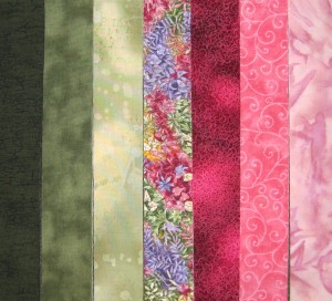 Bargello in Spring Fabrics
This process can take a bit of time as sometimes you think, “oh, this will look fabulous” and then once the fabric is put into the run it just doesn’t work. The more fabrics in the Bargello the more time is needed to get the colour run just right. Auditioning the fabrics and taking photos is the key to a great colour run. I have spent hours pulling fabrics from my stash and auditioning them in the group of fabrics – it truly is amazing how fast the times goes when I am doing this exercise.
What kinds of fabrics work best for Bargello? Almost anything will work but I do try to pick fabrics that show a lot of texture and depth in the pattern such as florals, hand-dyed fabrics, batiks and printed fabrics with swirls, geometric designs, dots, etc. Solid coloured fabrics should be kept to a minimum, 1 or 2 in a colour run is okay though. The more texture and variety in the fabrics the more interesting and effective the bargello will be. Mixing of cottons with batiks and hand dyed fabrics can be very effective and stunning although you can use all cottons or all batiks. I have even been known to use the wrong side of the fabric when I can’t find just the right fabric for that spot in the run. Fabrics that I do stay away from are prints with white in them as the white will tend to stick out in the design rather than blend in.
I photograph each set of fabrics that I put together and every change that I make. Putting them on the computer screen gives a better view of how the fabrics run together and also a better idea of the value of the fabric – whether it is very light, light, medium, dark or very dark. By taking photographs with each change, I can also look at a bunch of different options all at once – sometimes I go back two steps for every step forward as I mix and match fabrics to develop the effect I’m looking for.
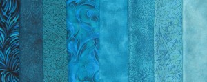 A run of teals
A handy tip to help you see the true colour value of the fabrics is to convert the photos to black & white – often times I am amazed at what I see, thinking that one fabric would be considered dark and discover that it is actually on the lighter end of the medium value.
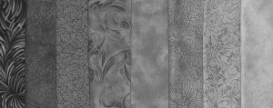 black & white version of the above teals
Seeing this set of teals in black & white definitely has me rearranging where fabrics have been placed and thinking about changing some out for others. I would definitely swap positions of fabrics 3 & 4 from the right hand side of the photo as the solid fabric is lighter in value than the print fabric beside it. As you can see this is quite a process and for some Bargellos the run comes together very quickly and for others there can be lots of tweaking to get it just right. As you might imagine, the more fabrics in the run the more tweaking that will be required.
This is just a little insight into fabric selection for Bargellos and if you have any questions please post them in the comment section and I will gladly answer them. I’ll leave you with a photo of a 14 fabric colour run from my art quilt which I designed for the International Women’s Day Art Show in Orillia called Diverse Light.
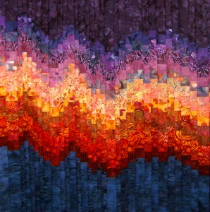 14 fabric colour run
Wanting to learn more about Bargello, colour runs and how a Bargello goes together join me this Saturday Sept 8 at Country Concessions in Cookstown where I am providing a free clinic demonstrating the Bargello technique I use and will also be putting together some example colour runs to help you get started. Drop in anytime between 9:30 and 3:00. Hope to see you there.
Until next week, Happy Quilting.
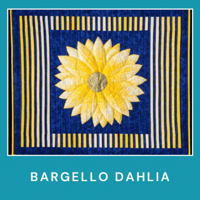
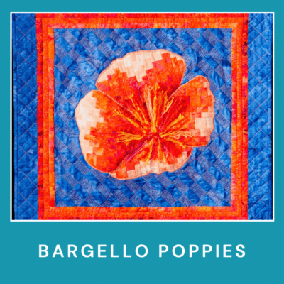
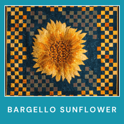
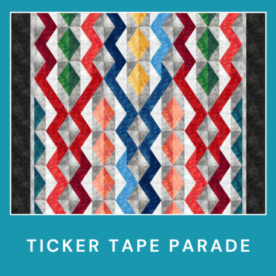
Please check out my series of Bargello Flower quilt patterns:



Great post Jen! May I add one more tip? Large prints used as a focus fabric do not work well because of the change in color throughout the fabric. When cut up you will end up with some sections completely different than others which can make the design look jumbled.
Thanks, Ruth for that great tip about large prints.
Jen,
Have been looking for a sunflower quilt to make for a wedding gift. This is beautiful. Is the pattern actually sent via post or is it sent e mail or a link. Would like to try this, as I’ve never done bargello,
thank you
AnneMarie
I want to thank you very much for this post. I have never done one but I want to. The colors selection is my first problem lol. Some posts says to use only solid colors. Other’s say no solids. You all say no large print though lol.
My problem has always been color selection. So how many different fabrics do I use? I want to do one in like earth tones but also want a color pop like blue, red, green maybe. My husband like earth tones but I like color too so any help? Lol
Again thanks and love your work
Kathy, you can use as many colours as you want for a Bargello but I do suggest making one from a pattern before attempting to design your own. I put batiks, cottons, prints, geometrics, solids, etc together all the time in mine. I do stay away from prints with a lot of white in them as the white will stand out. I would suggest using more muted blues, reds and greens with the earth tones so that everything blends well together. All the best with your project and happy quilting. Jen
Do you have a video of the demonstration of how to actually make the bargello quilt?
Unfortunately no video but I have had another inquiry for one so I guess I will have to put that on my to do list for the fall. Happy Quilting Jen
Can you do on line video of your class.
Teresa I will look at doing one but it won’t be until the fall as we are at an off grid cottage for the summer.
Thank you. for the posting Jen.. it help me a lot as a biggener..I am waiting for another tips..have a bless day Jen..
Dear Jen, I have just learn to use a computer and while browsing I come across your page. Is there a way I can get hold with your patterns or a book I can get. I enjoy looking at your designs and do love Bargello.