Hey Everyone, welcome back to Coffee Talk Saturday.
Today I am going to show you what we made after lunch in the print making class at the Orillia Museum. Last week I only showed you our relief printing masterpieces using lino blocks and water soluble ink from the morning.
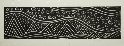
In the afternoon we could do whatever we wanted but still working on the small size otherwise we would have been there well into the evening cutting out design out of the lino block. I decided to work long and skinny. My piece is approximately 3″ x 11″.
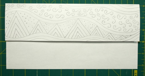
To begin I drew my piece out on a regular piece of computer paper.
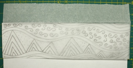
Then I traced it onto tracing paper with a soft leaded pencil. The reason for the soft leaded pencil is so that the graphite will transfer over to the lino block. The reason for tracing is so that the piece will be the same orientation as the original design on the paper. This step definitely needs to be done if there are any words or letters in the design.
Once the design was on the tracing paper I placed the tracing paper with design side down on the top of the lino block and rubbed the back of the paper with my pencil. Like when you use to put a penny under a piece of paper and rub the design to the top of the paper with a pencil.
The graphite transferred to the lino block leaving an outline of my design. I could then follow the lines and cut out my design much easier.
Once the design was completely cut out I was ready to add paint. Those little swirls took a bit of practice to get them just so. What was I thinking when I drew them on paper – certainly not that I had to cut them out of the lino.
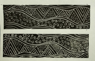
Once again I started with black ink and tested the design on regular paper. I could tweak the design if need be by adding more cuts if I wasn’t happy with the original. The bottom print does not have enough ink where as the top design I added more ink to the lino block and the result was a much more even spread of ink that transferred to the paper.
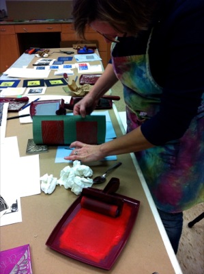
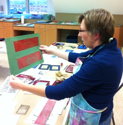
Moving onto coloured ink I tried red on fancy textured green paper. Here I am pulling the paper away from the lino block after transferring the red ink to the paper.
And inspecting my work.
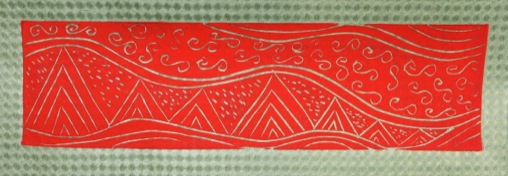
I really liked the look of this one and how the green showed through the design. It would make a great design for a Christmas card.
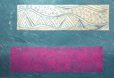
I then tried different colours and different paper just for fun. Here is pink on blue and silver on blue. Not quite as dramatic and eye catching as the red on green. Then again red and green are complimentary colours.
Now to try it out on fabric when I have a spare moment.
Happy Quilting!


