Hey Everyone, welcome back to Colourful Friday.
The last property of colour that I am going to talk about is intensity. Other properties of colour that I have spoke about are value which is the relative lightness or darkness of a fabric and temperature of colour otherwise known as warm and cool colours.
What is Intensity?
Intensity or saturation of colour can be considered the strength of the colour – how bright or dull it is. Intensity can also be considered high or low.
High Intensity Colour
These colours can appear to move forward in a quilt just like warm colours do. Often they will appear to be jumping off the quilt. They are usually pure colours and are very bright.
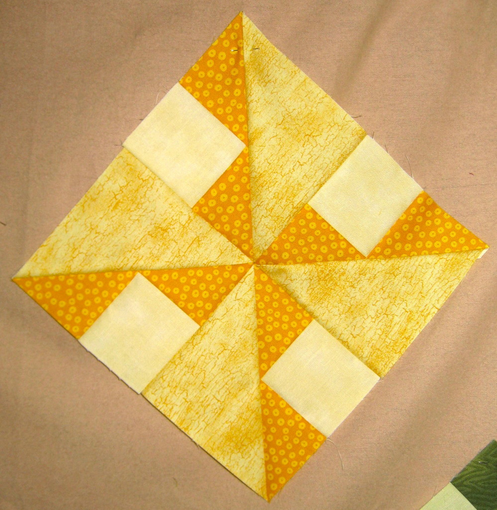
The bright yellow pin wheel appears to be in front of the rest of the colours as the dark yellow recedes into the background
Placed with black or white can change the look of these high intensity colours. With black they may appear more intense and with white they may appear duller. An example of this would be a jewel block quilt.The pure colours will not look quite as intense on a white background as they do on a black background.
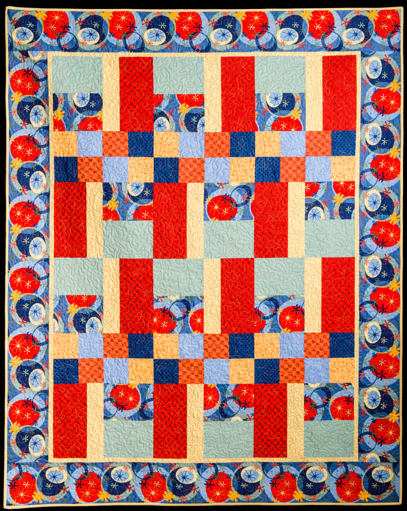
Too much of these high intensity or pure colours can be very hard to look at. These pure colours should be used as the focal point of the quilt. The red squares and circles are the focal point of this quilt. Being bright they stand out to the eye first. The dark blue squares are the second focal point. The other colours appear dull and fade into the background.
Low Intensity Colour
These colours will appear to recede into the background of the quilt just as cool colours do. They are usually very dull, pale or muted colours.
Some more examples
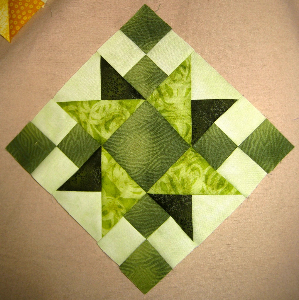
The bright lime green pinwheel pops out to the front of the block while the olive green squares recede to the background in this block.
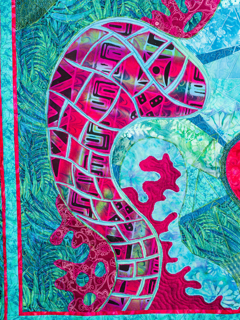
The red is the focal point of my Sea Serpent quilt as it is the brightest. The leaf fabric around the sea serpent is dull in colour compared to the red but the lighter aquas on the other side of the serpent even though they are light they appear bright as well.
Changing the Intensity of a Colour
There are four ways to change the intensity of a colour.
1. Add white to the colour otherwise known as tinting.
2. Add black to the colour otherwise known as shading.
3. Add grey to the colour otherwise known as toning.
4. Place next to the colour’s complement.
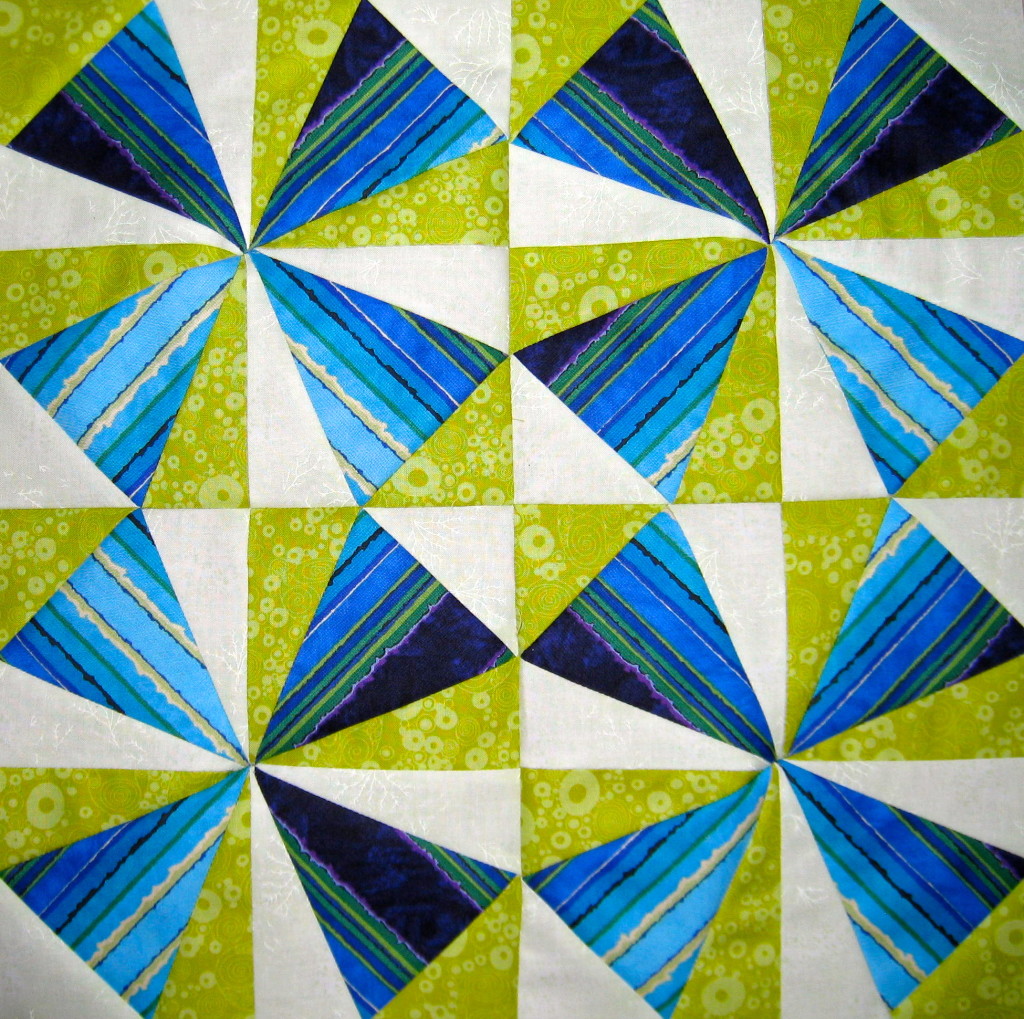
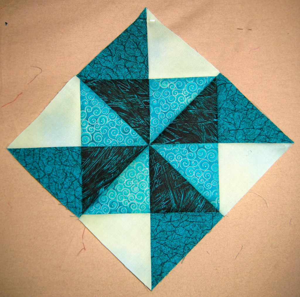
All of these four methods will help to decrease the saturation of the colour making it appear to be duller and less intense. In the block below the light fabric has had white added to lighten it, the darkest fabric has had black added and appears dull where as the bright fabric stands out as it has probably not had any additives and remains a pure colour.
Value has to do with the lightness and darkness of a fabric whereas intensity has to do with the brightness and dullness of the fabric. A fabric can be dark and dull at the same just as it can be dark and bright.
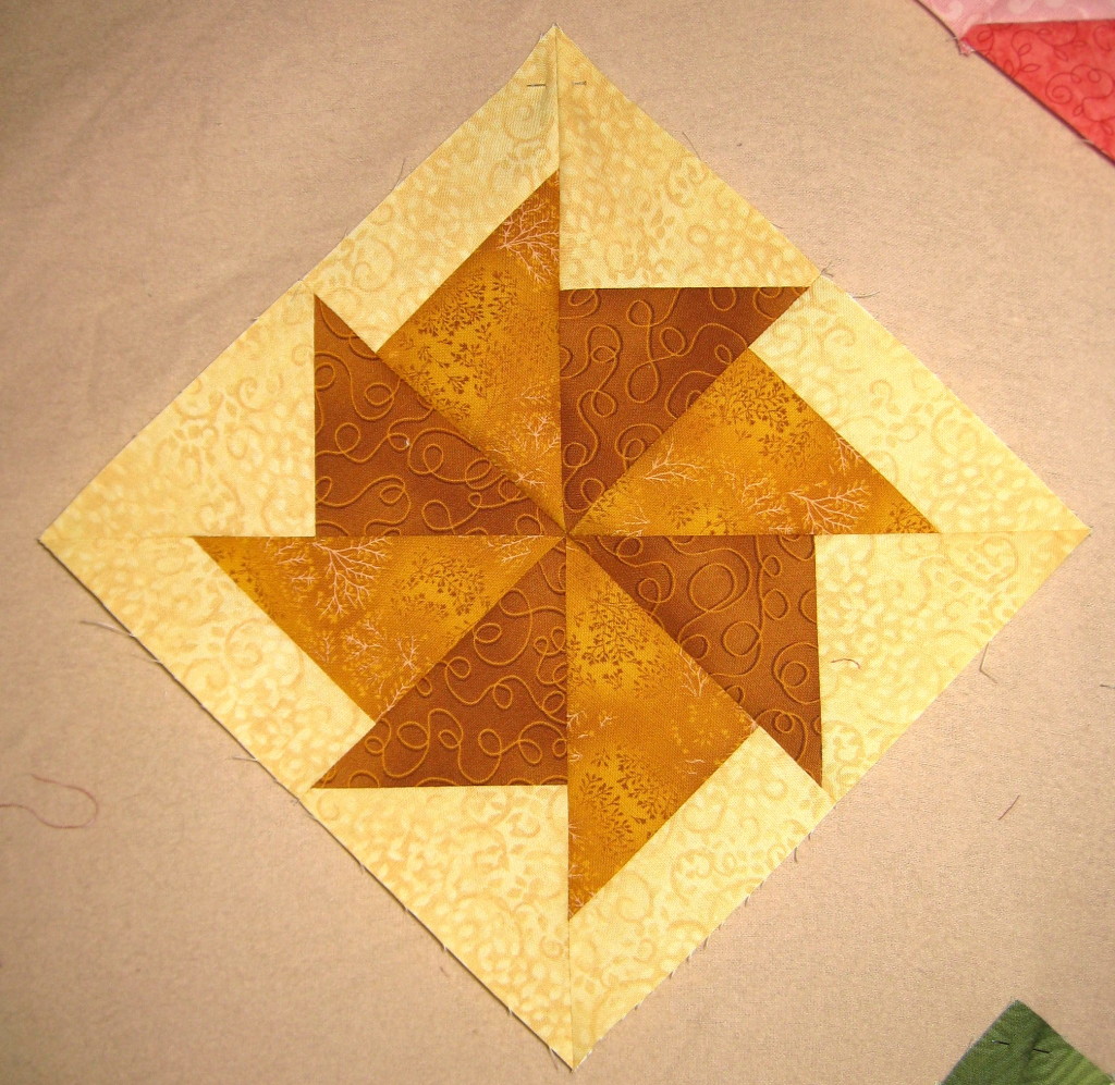
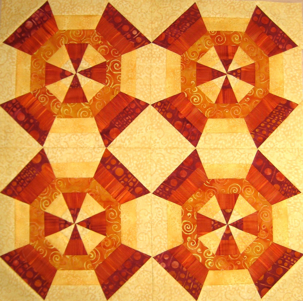
These four blocks are made with a gradated colour run from light yellow to dark rust. The dark rust fabric stands out in the quilt and is a focal point as it is also brighter than the rest of the fabrics. The light yellow and light gold fabrics tend to recede into the background on the outside of the block but then stand out in the centre of the block. This has to do with where they are positioned in relation to the darker fabrics.
Intensity of colour is important to know so that we do not overpower our quilts with these bright pure colours. Instead we want to have a balance of bright and dull fabrics in the quilt just as we need a balance of light, medium and dark valued fabrics to create an eye pleasing quilt.
Happy Quilting!

I linked this post up to Fiber Artist Journey’s Design Wall Weekend Party and Connie’s Freemotion By The River





Hi, Jen- What a wonderful and detailed explanation of color intensity. Your samples really make the points that you describe. Thanks for sharing this on Design Wall Weekend at Fiber Artist Journey!
Thanks Christina! It’s such a difficult topic to explain so I’m very glad it’s made sense.
Brilliant, I love this and can even make my brain understand it. I want this stuff about colour printed out in a folder in my quilt room for reference and to mess about on my design wall! Could you talk Michael into making a downloadable PDF with ALL the colour stuff in it.Please?
Hi Juliet. You bet. The plan is to create an e-book using the Colourful Friday posts.
Thanks for another interesting colour post. Great tips about pairing colours with black/white/grey to change the effect 🙂
You’re very welcome Janine. 🙂
Hi Jen,
Thank you for this awesome information about intensity. I have been quilting for 2.5 years, but still have trouble with intensity and value of fabrics. I hope you don’t mind, but I’m sharing the link to these posts on the facebook group Quilts and Things that I am a co-administrator of.
Teresa, go right ahead. I will look up your group and join. Thanks.
Thank you, understanding color can be confusing. I loved the explanations.
You are very welcome Lorraine.