

Hey Everyone, welcome back to Technique Tuesday.
So I’ve decided that I don’t want to make the curved piecing kit the same as the kit – I’m going to change it up and add some sashing in-between each section of the block to create a totally different look.
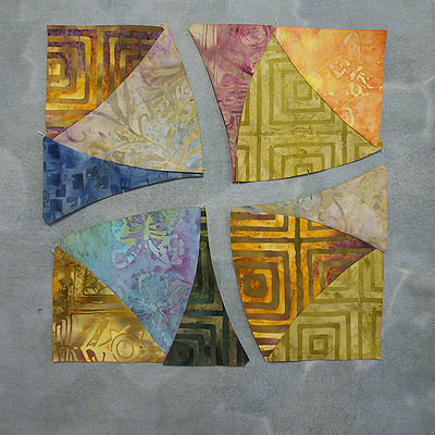
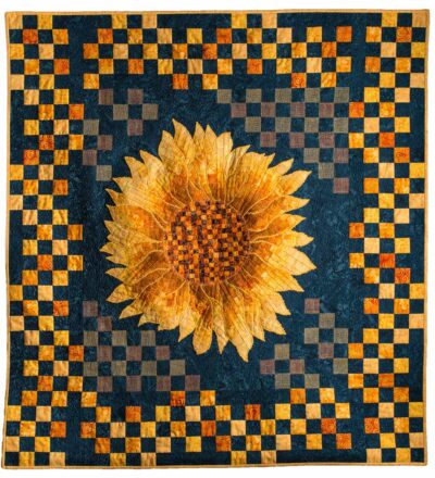
I did find out the name of the block which is made up of the 4 curved sections – the winding path block. Very appropriate name considering what I am thinking of doing with this block.
The colour of sashing will determine what look is achieved – high contrast is what I am looking for. The value of the sashing fabric will be playing a very prominent and important role in this design.
Auditioning Fabrics
I pulled a few fabrics out of the batik cupboard to audition as sashing and background fabrics to go with the curved sections.
Most of the colours in the pre-cut pieces are of medium value which means that I need to use either a dark or light value for the sashing and background in order to create contrast between the fabrics.
A great way to audition fabrics is to put them up on a design wall and stand back about 10 feet to view them – you need the distance to get a good feel for how they look together. If you have a design wall but not the space to stand back then a reducing glass works really well to view them with – gives a feeling of distance. And the third way if you do not have a design wall then taking pictures and viewing either on the back of the camera or on a computer allows you to see how they look together – this is my favourite method because you can view all the options at once.
Little to No Contrast
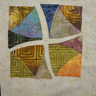
If there is no contrast then the fabrics will all just blend together and there will be no wow factor. This green fabric isn’t dark enough to create the contrast needed and the sections just blend into it. As well the green fabric is too busy.
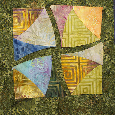
Green sashing and background
Dark Fabrics
I had a lot of dark batiks in the cupboard to work with but not near as many lights. And way more medium valued fabrics than I care to count.
Dark #1 – black with grey
I find the grey print in this batik to be a bit distracting which reads to me as more of a medium valued fabric than a dark with the end result being not as much contrast as I would like.

Black with grey print
Dark #2 – purple
The purple isn’t bad but still lacks the high contrast that I am looking for – no wow factor for me but hey maybe there is for you. Each of us sees colour and fabrics in a bit different way.
Purple background
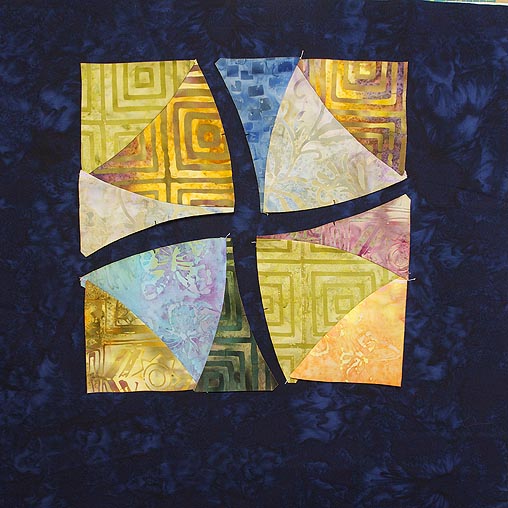
Dark #3 – slate blue
I like this fabric and love the colour but am thinking that the lighter parts of the fabric are too light.
Slate blue fabric for sashing
Light Fabrics
Light #1 – grey
This grey is okay – I like the softness of it yet it still has contrast.
Grey fabric as the background
Light #2 – cream
The cream is pretty high contrast to the section fabrics and allows them to stand out and say here I am. Definitely a contestant. I’m not sure I like the circle print in the fabric – I’ll have to look at it a bit longer.
Cream creates contrast
High Contrast
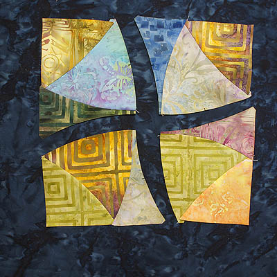
High contrast #1 – black
This black with undertones of brown I think looks great. I was wanting a dark chocolate brown but didn’t have one so with the black I get a warm colour to go with the section fabrics as well as the high contrasting black.
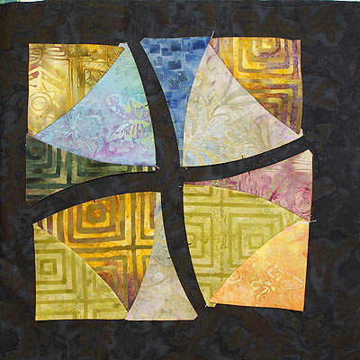
Black/brown batik for background
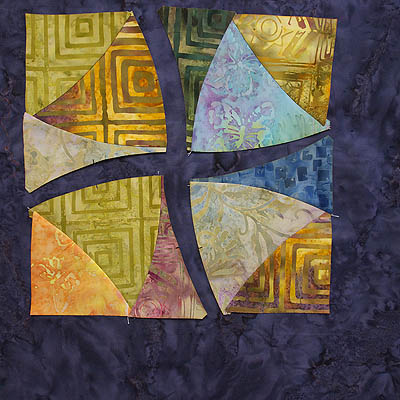
High contrast #3 – blue
The blue is awesome but then again I do love blue. Especially this bold intense blue batik.

Dark blue batik has pizzazz
Well, now I have a decision to make. I could pick just one or I could pick two or three fabrics and make 3 different pieces – heaven knows I have enough pre-cut pieces to do that. Just make some table runners and see what happens to the look of each with the different background fabrics.
Which is your favourite? Leave a comment below.
Now that I have rambled on I’ll leave you for today and be back later this week with the winner or winners. I’ll even show how easy it is to add some curved sashing to the sections – maybe even a border.
Happy Quilting!


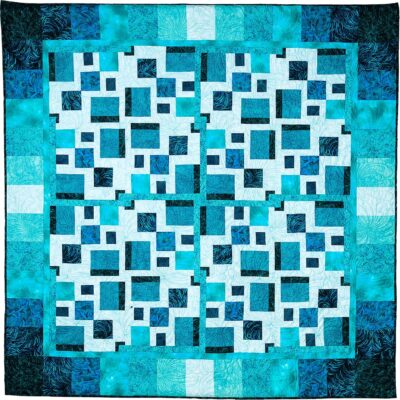
The last option – High contrast #3 – blue (dark blue batik) makes all other colours look so luminous they shine. I like the other dark ones, too, but this one is just stunning.
Some colours look great together, they interact with each other, make the other colour look lighter, darker, or more intense. But when they make it glow – that’s a different story, the creation becomes alive, vibrant, and full of energy.
The joy of being and artist, and the joy of creation 🙂
The blue # 3 pops out all of the colours, not just some…however would you also have a small 1 1/2 ” blue border around everything as well …and then what colour would be the wider boarder????Sorry not any help…just more questions..
The dark blue is by far my favorite. I like the lightest cream color, too, but that will make a totally different quilt. I will be anxious to see what you end up choosing!
I the dark blue. I think it gives it a sparkle. I had this kit too and actually just did it last summer. I set it up so that different colors made circles but sure like your idea.
My absolute favourite is the dark blue. My least favourite is the grey. The cream is nice too. Adds softness.
The high contrast #3 blue is definitely my favorite, but then blue is, and always has been, my favorite color. The colors of the block really stand out against the dark blue and catch the eye. Love these curved pieces for the block!!
Looks like the dark blue is well in the lead. It is a spectacular colour.
I prefer the blue or the black. It will be a stunning quilt!
My number one pick would be the purple, and then the dark blue or black. Black makes everything pop. I do not care for the light fabrics with it. Thanks for asking.
Mary
My first choice would have to be the High Contrast #3 Dark Blue. And next would be High Contrast #1 Black. With the high contrast, it make the colors in the blocks “pop”.